The interface is a simple canvas with a series of tools organized and color coded by category from a top menu. Each tool is represented by an icon or node which can be dragged and dropped onto the canvas. Workflows are automatically created when placing a new node next to an existing one; Alteryx immediately recognizes an association and connects them seamlessly.
Loading data
The first step in a workflow requires loading a dataset. This is handled easily by dragging an “input data” tool onto the canvas. You are immediately prompted to select a data source; this includes everything from simple flat and csv files to various databases such as SQL Server, Oracle and more, including Hadoop files and other ODBC databases, Taradata Bulk, OleDB, ESRI, etc.
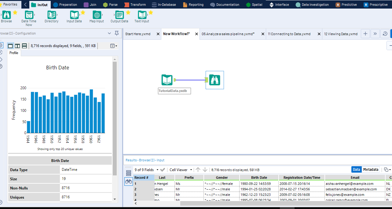
Depending on the type of file, you are prompted to choose a number of parameters. A normal next step would involve dragging a “browse” tool which enables you not only to see your actual data, but also to recognize some basic patterns. By selecting a column of the data, a graph is displayed demonstrating frequencies of values within the data. It automatically recognizes various data types, such as dates, as shown below.

As you can see, this is the result of connecting only two tools; the “data input” and the “browse” tool.
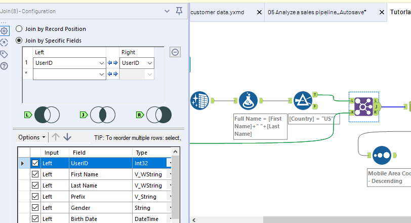
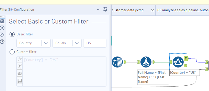
Of particular use for direct mail marketers, are custom filter tools. For instance, say you are running a campaign that is targeting only US. However, your dataset includes information about people outside of your target market. By using a filter, you can choose only those within the US. The tool also creates a simple boolean switch so you can easily toggle between those for whom the indicator is true or false. You can also create custom formulas for creating more advanced filters.

Joining Data
In many cases, you have several different datasets, which if combined, can provide more information than you would have in only one file. For instance, let's assume that your first spreadsheet contains data regarding the location of your customers. If you have a separate spreadsheet provides a list of visits by customers to a store, you can create a parallel workflow, and combine these using the “join” tool. If both sheets share a common id, the process is relatively easy, and this creates a common file with all of the necessary data.

By applying a few other tools, one can easily output the data into a .csv, database, tableau, or other formats, for use in further analysis, or you can apply it directly to the next stage in your current workflow.
Predictive Modeling Tools
As direct marketer, anything that can increase your conversion rate is ideal. Through the use of some good data analysis, you can identify factors regarding those who have responded in the past, and using this, identify key characteristics regarding this group of people. If you have a large enough dataset, it can be possible using predictive modeling to determine which groups are most likely to respond positively to a mailer, and create a model to help you in future campaigns.
Alteryx provides a large selection of predictive modeling tools created using Hadoop and R. From the perspective a professional data scientist, this can be extremely valuable. However, as Alteryx is codeless by design with a drag and drop workflow interface, these are accessible to non-experts to gain a better understanding of your data without a highly specialized toolset.
Data investigation tools include field summaries, heat plots, and more, and has built-in features for association analysis, contingency tables, distribution analysis, and various weights and correlations.
Other built-in tools include an R-based scoring tool which enables creating weights for building customer models for your direct marketing campaigns. Also particularly helpful are various predictive grouping tools, such as Append Clusters, K-Centroids, MB Affinity, Inspect and Rules, and far more.
Data Visualization
Alteryx provides a number of industry leading tools which can help with the visualization of data. By combining a number of different datasets, you can overlay results so that you can see how it looks in a spatial sense.
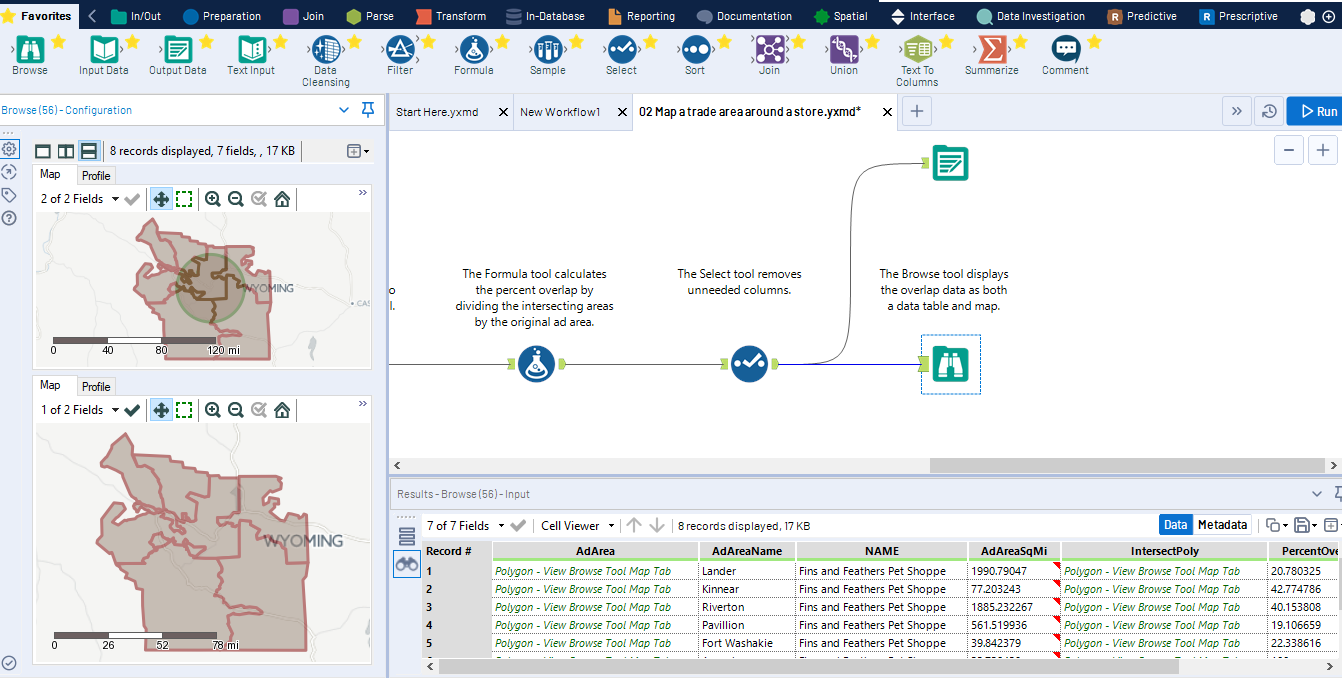
For example, if one has data stored in spatial polygons, datasets can be combined visually using a built in “spatial process” tool. Using the same “browse” tool we described before can work at any point within a workflow, and demonstrate how the data looks within a map overlay.

Report Design Features
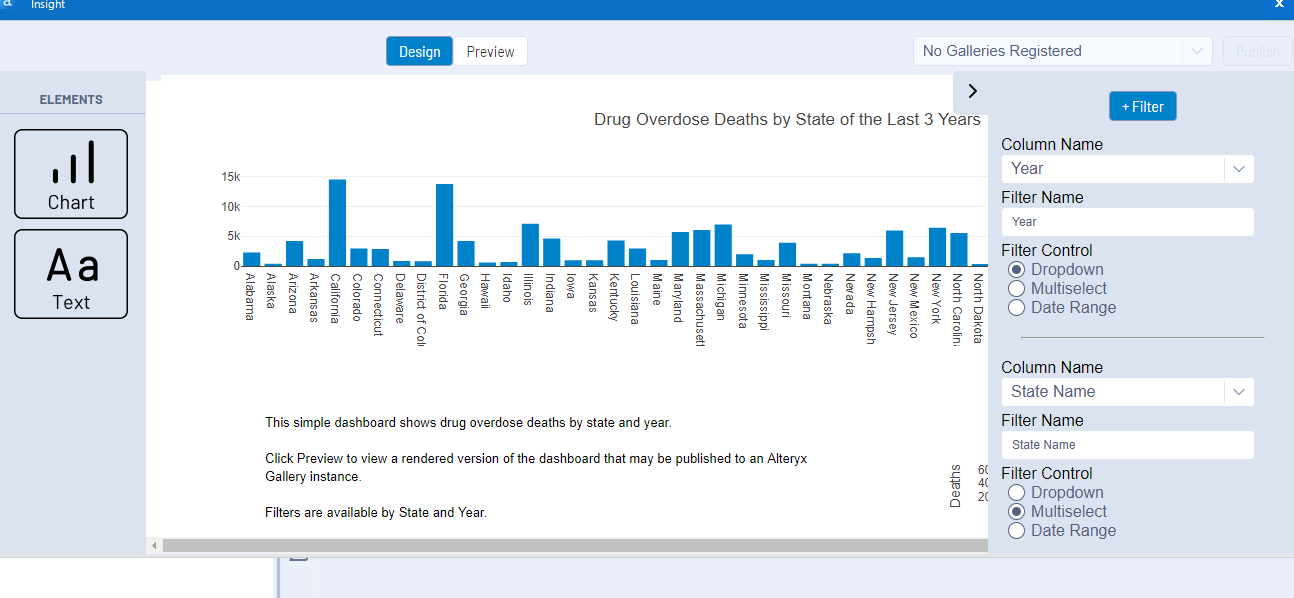
Alteryx provides some easy to use tools for designing reports. By dragging and dropping elements, and creating basic text, one can draw out items to be used for visualization in a dashboard.

Customizable User interfaces
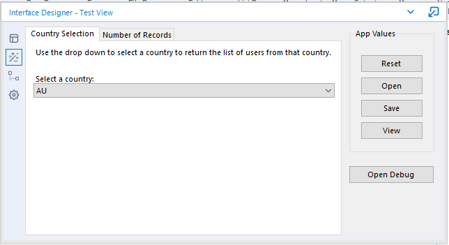
One can customize interactive models for business users. One can create new tabs, change text and add filters to enable changing views of data on-the-fly. The example below demonstrates a couple of simple tabs, with a country filter. The second tab enables specifying the number of records that might appear in a table or chart.

Downloadable templates
One of the most valuable aspects of Alteryx its community. In many cases, the analysis that a user is attempting to perform may have already been completed by someone else. Users are encouraged to share templates, so that others do not need to repeat processes that someone else has already figured out. This can make the creation of workflows considerably easier and save a tremendous amount of time, even for more advanced users.
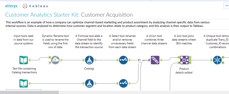
As a result, there are many downloadable templates which may be invaluable for direct marketers. For instance, below is a piece of a Customer Acquisition Model for channel-based marketing. It combines multiple data streams, and processes them into a standard format which can be exported as a Tableau file. (It is important to note that many of these templates have some dependencies which require downloading and installing various extra modules. However, this can be done fairly easily).
