Help & Support

212.660.6600

Tableau

A review of the use of Tableau as a Business Intelligence tool for Marketing Data Operations

Try it now
4

Introduction

To be able to gain the best understanding of what our data means, we often need to be able to manipulate and view our results visually. As humans process images far better than text, by providing charts and plotting graphs, we are often able to more quickly comprehend the meaning of data. We can start to understand what clusters of data mean in relation to the larger dataset, and can identify trends as they occur.

In a marketing organization, we may have a list of numbers, or even a summed up table of aggregations of our data, such as, for example, the number of women aged 35-45 who purchased X product in New Jersey. We may know the actual number, and we may know the percentage of the overall population, however with a business intelligence tool, we can manipulate this data on the fly to be able to identify which factors impact others without having to comprehend lists of time-consuming manual calculations.

Tableau is a suite of business tools available for precisely the purpose of quickly gleaning information out of data, and to be able to create dynamic visual representations, and to share with teams or others via presentation, and to eventually publish these tools to a website or API.


The Suite of tools contained within Tableau includes:

  • Tableau Desktop – Data Visualization and graphing tool
  • Tableau Prep – ETL tool for preparing data for analysis
  • Tableau Online – for sharing and collaboration
  • Tableau Server – for publishing the results to the web.

For the purposes of this review we will be focusing on Tableau Desktop, with some brief discussion of how it integrates with Tableau Online and Tableau Server. (Tableau Prep is a separate piece of software and will be covered in a future review)

Features

We will approach the features that Tableau provides from the perspective of a marketing campaign. Let’s say we have a list of existing customers across multiple states, each has made purchases of a wide range of different products, and we simply want to get a better picture of how these purchases have been made, and by whom.

Data Preview

Tableau allows you to load a simple Excel file or CSV including some basic data regarding your customer list. You can see a quick preview of the first 1000 lines with a single click. Data is sortable, and you can see that various data types are already recognized, and formatted accordingly
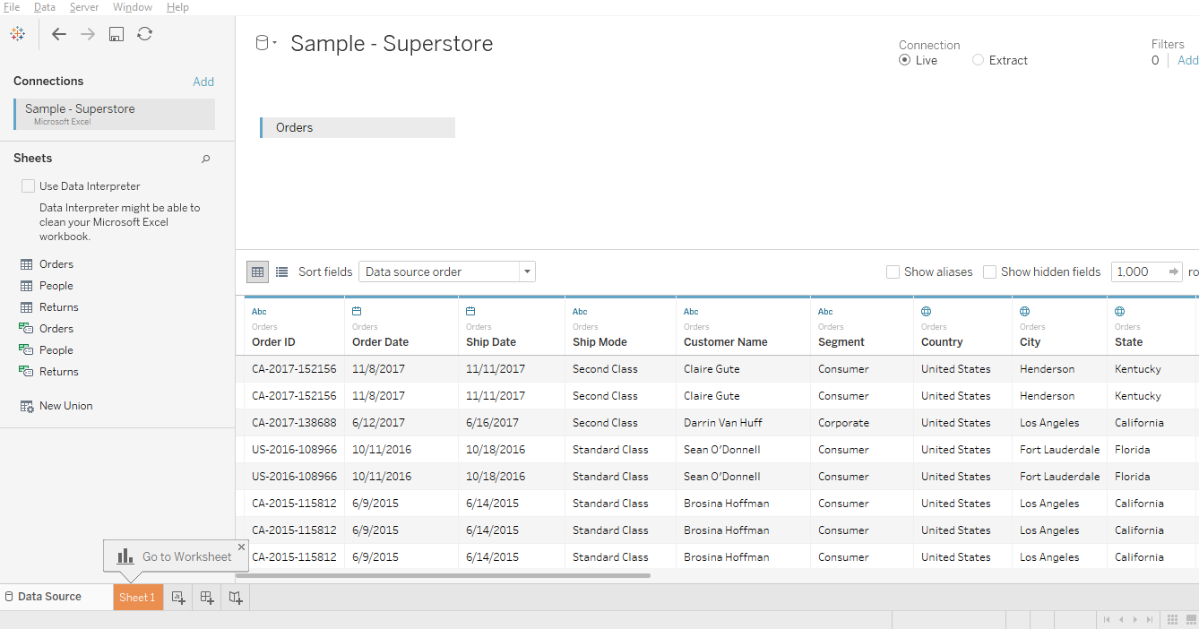


image1_9.png


Table Creation

The data in your columns is listed in a menu on the left side of the screen. By dragging a few items into a column and/or row, you can create a quick pivot and get a clear summarization of your data. For instance, by choosing “year” and dragging into the column field, and then state into the row field, and grabbing sum and dragging this into the center, we can get a quick summary like this:


image2_7.png


You can zoom in on any individual data entry and get more detail.

Filters and graphing

One can easily choose from a wide array of available charts from a menu on the right. These are automatically and dynamically created with little or no intervention from the user.

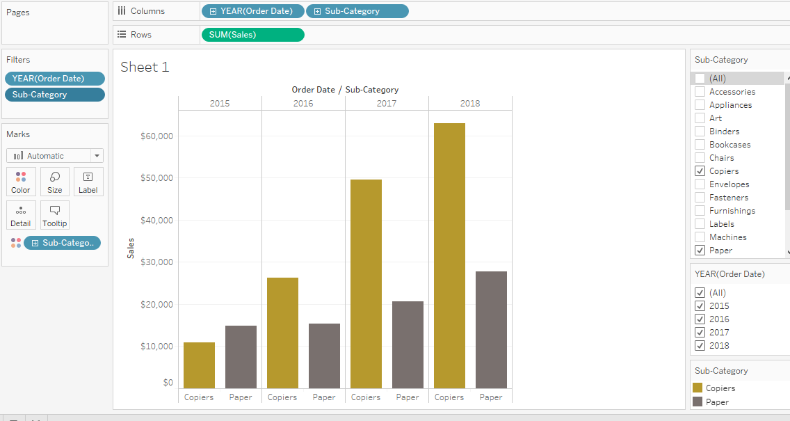
You can quickly filter your data to zero in on small subsets of data to be able to see individual details. For example, below we can quickly examine the relationship of two potentially related items (copiers and paper). We can often see things that may not be immediately evident and may not fit our preconceived notions, which can help us identify new ways of looking at our data. In this case, the amount of paper used did not increase steadily with the number of copiers purchased, suggesting that one does not necessarily drive the other except slightly over time.


image3_7.png


It is important to note that when using filters, changes are cumulative, so Tableau seems to keep adding new parameters. Tableau makes a few assumptions about what sort of data you are working with, and they may not produce the types of analysis that you wish to get or need, so it is important to be careful when constructing your charts. The order in which filters are provided can influence how the data is represented.

Managing this can be a little confusing; there does not appear to be a way of editing individual steps without undoing and redoing filters and charting.

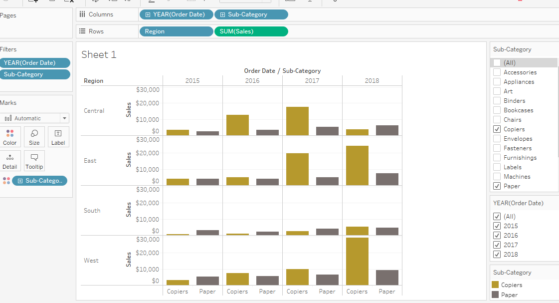
Variety of Charting functions

You are given a wide variety of tools for organizing data. For example, below is a summary of sales broken down by regions of the country and year.
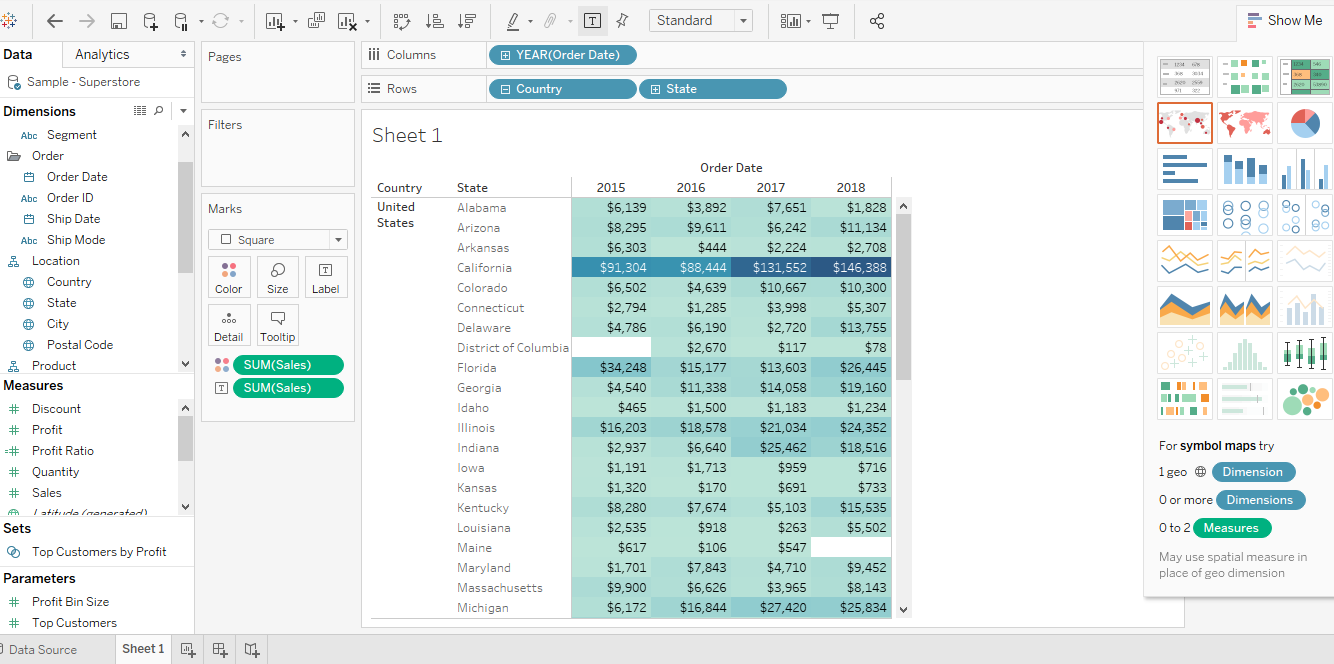
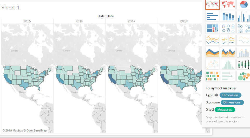
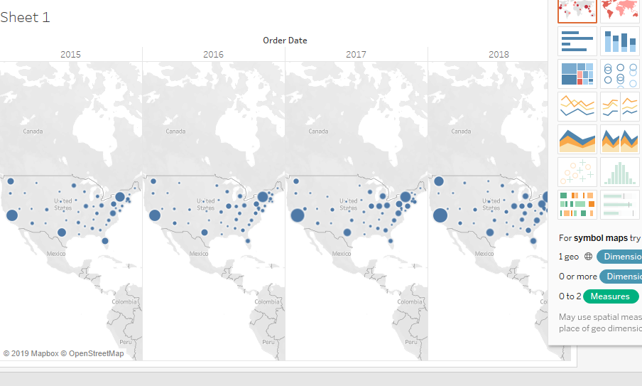


image4_6.png


Geographic Features

For mapping data, Tableau has a number of built-in features. It automatically recognizes state names as geographic entities, and includes some predefined “regions” within the US (e.g. south, west, central, east). It also stores longitudinal and latitudinal data for cities and states to make it possible to quickly map data.


Here are a few examples of the sorts of charts one can generate, based on the data we provided earlier:


image5_6.png image6_6.png


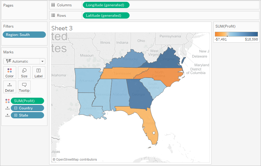
When zeroing in on certain regions, you can create color coded “heat maps” of where the strongest concentrations of data lie. For instance, in the below map of the “southern” region of the US, blue represents profitable areas. The darker the color, the greater the level of profit. Areas in orange represent losses, and similarly, darker orange colors represent greater loss.


image7_6.png


Dashboard

One of the most useful features in Tableau is the ability to quickly create multiple dashboards to be able to view multiple different types of data together. These can help both with analysis and presentations, which can help us generate “stories” and can help us walk through data interactively in meaningful ways.


image8_3.png


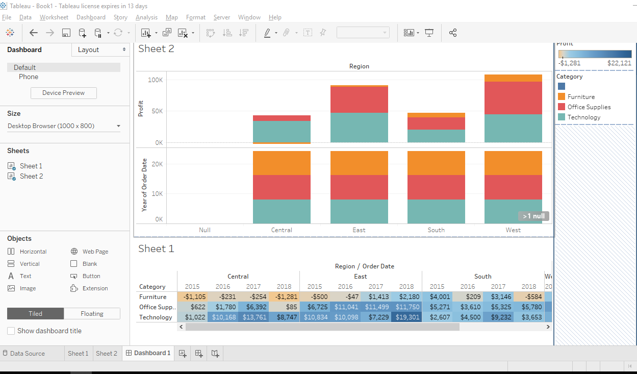
These dashboards can be helpful for individual users to for personal edification of theories, or for creating presentations for other users.


Presentations

Presentations can be put together using various dashboards, and with interactive slides. By putting together your data to tell a story, you enable your audience to visualize and understand how various aspects of data interact with each other. You can simply display data, and make real-time modifications directly in front of your audience to demonstrate in clear fashion what causes what.


Sharing findings

Once you have constructed information to make your point, Tableau provides the ability to share your findings with other interested parties.


Tableau Public

For interacting directly with a team, one can easily share information between different users and workstations. Results can be embedded directly into web pages, so presentations can happen remotely.


Tableau Server

When data is ready to be publicly delivered, Tableau Server will hold all workbooks, presentations, analytics and dashboards for when they are ready to be delivered to the public through a website. It’s important to note that while Tableau has its own server, it supports connections to pretty much any other database server and has a wide variety of integrations.

Summary: Key Takeaway

Overall, Tableau can be a useful piece of software for direct marketing companies, depending upon what purposes it is used for. It’s strengths are in its data visualizations for end users. If working with data to generate stories and presentations, Tableau is excellent.

However, as a business intelligence tool for large organizations, it is a bit lacking. The fact that it has no built-in report scheduling functionality in the basic version makes it a weak contender for providing enterprise level dashboards. It’s best use-case is as a desktop tool, which can work well alongside many other standard office products, including word processors, spreadsheets, and presentation software.

Integrations

Pimcore generally takes a one-size-fits-all approach. Instead of many built in integrations, it provides a fairly rich API. Files are typically downloadable in CSV format.

File types

  • Excel
  • Text
  • JSON
  • MS Access
  • PDF
  • Spatial Files
  • Statistical

Servers

  • Tableau Server
  • Actian Matrix
  • Actian Vector
  • Amazon Athena
  • Amazon Aurora
  • Amazon EMR Hadoop Hive
  • Amazon Redshift
  • Anaplan
  • Apache Drill
  • Aster Database
  • Azure SQL Data Warehouse
  • Box
  • Cloudera Hadoop
  • Denodo
  • Dropbox
  • Exasol
  • Firebird
  • Google Ads
  • Google Analytics
  • Google Big Query
  • Google Cloud SQL
  • Google Drive
  • Google Sheets
  • Servers

Also provides access via

  • ODBC
  • JDBC

Xperra Star Ratings

Overall functionality useful to a direct marketer
4 /5

Tableau’s strengths for marketing organizations are self-evident in the product itself. Being able to provide clear visual representations of market data is useful for both analysis and for presentation. Tableau also has demonstrated that it can handle large datasets (hundreds of millions of records) quickly. It is easy to get running for most organizations: Getting both the desktop and the server running up in a day is possible.

Tableau has a pricing model that will work well for many small companies, however, scaling up for larger organizations can become expensive quickly. One notable feature that it is lacking is that it has no scheduling functionality unless you invest in the server version, meaning that it is not an ideal tool for running an enterprise-level dashboard without doing some heavy integration into other tools.

Intuitive User Experience
4 /5

At first use, Tableau creates a positive user experience. It has appealing graphics which can be created immediately on the fly, and the interface is intuitive. Tableau will immediately provide excellent data visualization for immediate insights into data.

The drawbacks start to appear a little with some experience. Tableau appears to be a bit overdeveloped. It is overloaded with features; it suffers from the all-too-common problem where software that is good at one thing (data visualization) tries to provide everything for everybody (low-level analysis). It does a lot automatically, which can be good at times, but it can make it a little more difficult to get under the hood and have it do exactly what you need it to do. For instance, if it looks at numeric data, it makes the assumption that you want a plot chart, even if you really want it displayed as textual data in a row, so one needs to convert numbers to strings.

Other drawbacks include the fact that it provides no versioning; it’s not possible revert through various stages of a report, nor can it recover previous versions.

Active Support Community
4 /5

According to the factors we use, Pimcore's support community appears a little weak. While there is some activity on the forum, it does not appear to be particularly responsive. However, the tool itself is relatively easy to understand, so this may be a factor in the small amount of activity. There are a lot of contributors to the project on Github


Tableau Community

www.tableau.com

Forum community.tableau.com

Tableau is a fairly popular piece of software and is well liked by a strong community of users. Their forums are active; it’s common to see multiple new posts daily. They also have enough interest to hold conventions, and run contests.

Minimal Technical Skill Required
4.5 /5

For a beginner starting out, Tableau is easy to use. The first run through almost did not even require a manual. Once it became evident how to access data, and run a few pivots, it became intuitive, and did not require much expertise at all. However, if one is to move beyond working with Excel spreadsheets and CSV files, some knowledge of databases and SQL will become required to be able to configure the relationships properly.

Related Articles

Marketing leaders make data-driven decisions with Tableau

Marketing leaders ma...

Learning Path: Your Guide to become a Tableau Expert

Learning Path: Your...

Tableau: Is It The Business Intelligence Solution For You?

Tableau: Is It The B...

Related Experts

Data Visualization Engineer

Data Visualization Engineer

Data Engineer

Data Engineer

Solutions Advisor

Solutions Advisor

Alteryx Designer

Alteryx Designer

Business Analyst

Business Analyst

Related Solutions

Tune Your Data For Peak Performance

Tune Your Data For Peak Performance

Other Tools

Alteryx
Data ETL & Data Wrangling Commercial

Alteryx

Alteryx is the only quick-to-implement end-to-end data analytics platform for your organization that allows data scientists and analysts alike to solve business...

KNIME Analytics Platform
Data ETL & Data Wrangling FREE Open Source

KNIME Analytics Platform

KNIME Analytics Platform is a powerful free open source data mining tool which enables data scientists to create independent applications and services through a...

Talend Open Studio
Data ETL & Data Wrangling Limited Open Source

Talend Open Studio

Talend Open Studio is designed for enabling one to extract diverse datasets, normalize, and transform them into a consistent format which can be loaded into...